Weekly Workshop Tasks and Projects.
Week 1: What is Digital Media
We often fall into the trap of simply listing the latest media technologies and labeling them as "new." All 'old' media were once seen as 'new,' and eventually, today’s innovations will feel just as dated. This raises important questions about what is truly innovative for society. Scholars have ascribed key concepts such as convergence, participation, and data-driven dynamics to digital media. “Convergence” is evident in how different media forms blend together, creating richer ways to communicate. Then there’s “participation,” which encourages us to shift from being passive consumers to active creators, prompting us to reflect on how our voices shape the media we engage with. Lastly, the “data-driven” aspect of digital media highlights how algorithms influence what we see and experience, introducing complexity and potential bias into our interactions. Together, these concepts illustrate that digital media is a complex ecosystem that reshapes communication and interaction in contemporary society.
Week 2: Creating Websites
The preparations for my Digital Practices workshop began the night before. I started by installing the recommended software for client hosting, File Transfer Protocol (FTP) known as FileZilla, and an HTML and CSS editor named Brackets. As the software downloaded, I began watching the recommended course on how to make a website on CODEACADEMY, learning how the Hypertext Markup Language (HTML) syntax affects the structure of a site. After a couple of lectures, I wanted to experiment with the language myself, only to discover that FileZilla was not compatible with my laptop’s current operating system. To clarify, I hadn’t upgraded my laptop's OS because the latest versions would render my laptop unusable.
I searched for older versions of FileZilla, hoping to avoid embarrassment at the workshop, but these efforts were in vain, as older versions are often removed to save precious cloud storage space. In despiration, I tried to find alternative FTP software, thinking anything would be better than nothing. However, on the day of the workshop, we all became disoriented. The internet we all grew up with suddenly felt like an uncharted territory. It wasn’t just the lack of the “right” software that perputated anxiety, altough it made its contributaions; witnessing the nuts and bolts of the internet caused a sense of displacement.
Our instructors did their best to guide us through activating our hosting accounts and adding HTML files using FTP software, but it felt like too much to absorb in a single day. The main reason for our confusion wasn’t just the complexity of the tasks—though we were all novices—but rather how our perception of the internet as a coherent, always-available tool was shattered. What had once been a quick, seamless, and interactive experience became slow, cluttered, and overwhelming.
However, once I set up the HTML file and got my website running, I felt an intimate connection with the internet. Witnessing its complex web of connections transformed it from a mere platform for consumption into a living entity full of possibilities. Understanding the interplay of code and design made me realize I was no longer just a passive consumer but an active participant in a vast network.
Lastly, my experience with software incompatibility made me realise how digital artifacts are not immune to the ravages of technological change. This realization coincided with the last breaths of my previous laptop, forcing me to buy a new one and contribute to the cycle of upgrades. As I transferred my files and memories to the new device, I reflected on the countless digital relics that would be lost—documents, photos, and projects that defined moments of my life, now trapped in an outdated system. This transition made me ponder over the fragility of our digital existence and the inevitable march of progress that leaves so much behind.

The tumbnail of this post was generated using Meta's Llama Model
Week 3: Web Scraping
Bursting with excitement of hosting my own website and completing a dense reading on “The Multiplicity of Algorithms” by Taina Bucher, I felt ready to embark on the journey to learn the web scraping. As usual, the preparations for the upcoming workshop began the night before the workshop. In the instructions for our workshop, I was asked to download “OutWit Hub” a web scraping software. When I tried to install this software on my new laptop, an error popped up explaining that Apple “App store” cannot verify this software and I should inform the developer about this. After some scrutiny, I realized that although the DMG file was executable on my laptop, it was designed primarily for Intel 64 architecture CPUs. As a result, it was incompatible with my Apple M1 architecture-based laptop.
This issue of compatibility leads to a broader concern, especially when it comes to web scraping. Web scraping is all about pulling data from websites, but if the tools you’re using are designed for Intel 64 architecture, you might run into the same problems I faced. For those on M1 systems, it can be frustrating when the software isn’t optimized for ARM architecture. This gap can limit access to important data, highlighting the need for tools that work well across different hardware. As more people rely on data for insights and decision-making, ensuring that web scraping tools can function smoothly on various architectures is crucial.
In the workshop, I was introduced to web scraping and how the underlying code of online contents can be used to “harvest” data. According to the instructors, the data is ‘out there” and we just need to learn how to extract it, predominately by identifying the markers of our “query.” After a short exercise on markers, we quickly went on to “OutWit Hub,” where I tried my best to concentrate and catch up, but unfortunately, I could not. I will partly blame my fixation on perfection and the lack of software compatibility for this outcome. This section of the workshop transitioned into the availability of web scraping extensions, which I was lucky to integrate in my chrome browser.
As not all web scrapers with default settings can accommodate our specific scraping queries, the next section of the workshop introduced us to the concept of building our own web scrapers from scratch using various web scraping extensions. This hands-on approach empowered us to customize our data extraction processes, allowing us to tailor the tools to our unique needs. However, while diving into the technical aspects of web scraping, I couldn’t help but wonder what Taina Bucher might think about this practice.
Bucher emphasizes the inherent biases and complexities of algorithms, and I could see parallels in the realm of web scraping. Each scraper we create is influenced by our own decisions—what data we choose to extract, how we structure our queries, and the underlying assumptions we make about the value of that data. This customization not only reflects our individual perspectives but also raises questions about the ethics of data collection. Are we aware of the potential biases that our scrapers might perpetuate? How do our choices shape the narratives we build from the data we gather?
Moreover, Bucher’s insights into the power dynamics of algorithms made me reflect on the implications of our newfound abilities as web scrapers. While we gain the power to extract information and create meaning, we also take on the responsibility of understanding how our actions can influence knowledge production. In this light, the workshop became not just a technical learning experience but also a moment of critical reflection on the broader societal impacts of our digital practices.
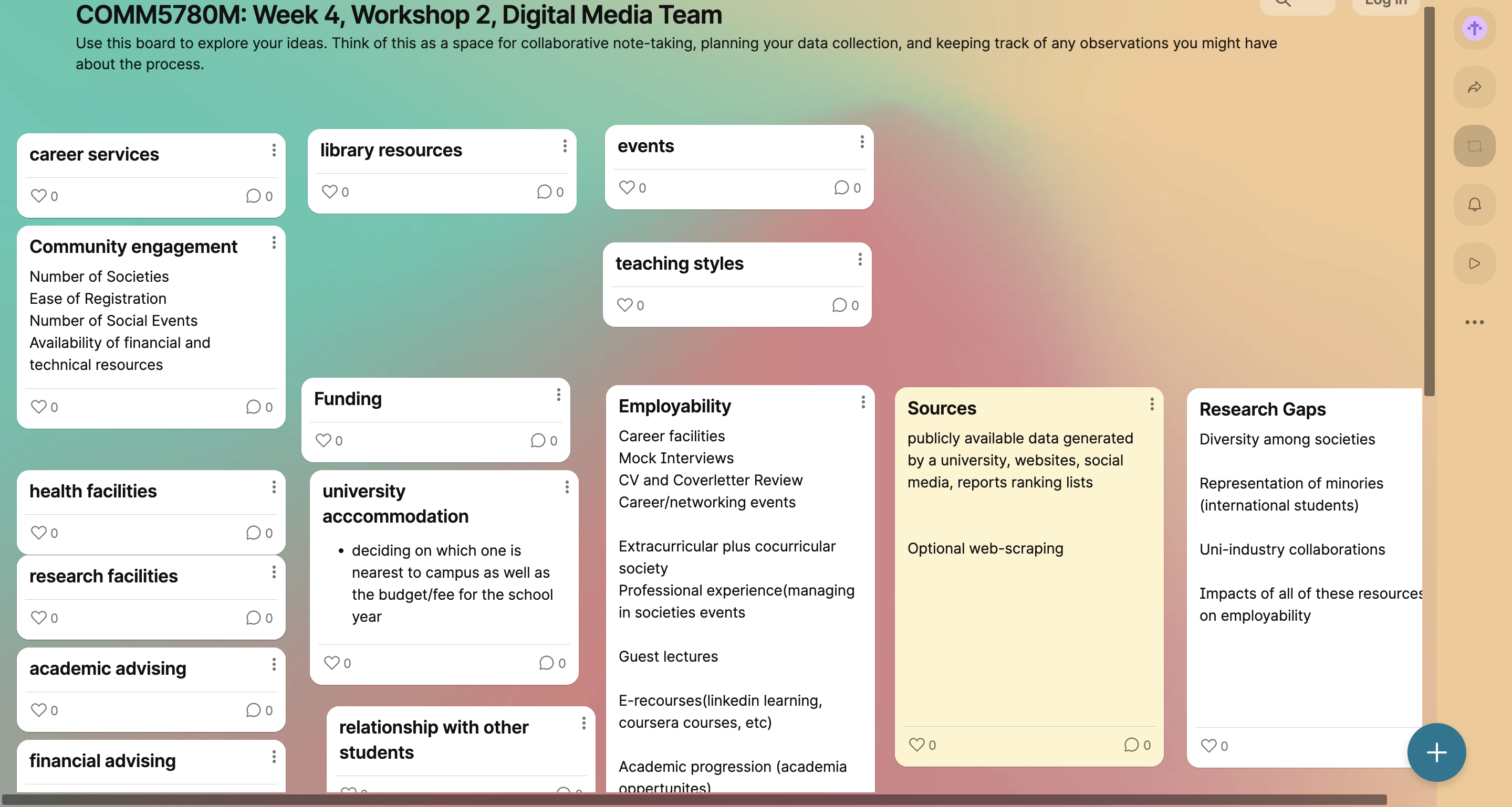
Week 4: Data, Power, and Classification
Although it's still early to judge, data appears destined to be the defining buzzword of the 21st century. But how did we reach this point? How has humanity—a species often tethered to its primal instincts and struggle to uphold laws and ethics—become so captivated by numbers and metrics? The answer to this seemingly simple question lies in the sociological, political, and scientific aspects of human evolution. However, perhaps owing to her thoughtful approach, this isn't how our instructor, Dr Steel, introduced data in our workshops.
Instead, she encouraged us to start by exploring different scenarios and considering the types of data we might collect, along with the complexities that could arise. To facilitate this, she nudged us to work on one of the given scenarios by collaboratively by mapping out ideas, making observations, and planning data collection process. Hoping to avoid the fatigue of considering too many perspectives, we settled on what appeared to be a straightforward, relatable scenario: student-led data collection focused on enhancing the student experience. But, if only it had been that simple.
As an ‘experienced’ researcher myself, I took the helm, only to find myself leaving the ground in complete disarray. In trying to define the student experience, I mistakenly equated it with the impact of campus facilities on employability—effectively creating a new scenario itself. Dr Holly, though clearly aware of our divergence from the original focus, played along and encouraged us to think through how we could collect data for this employability scenario, all while treating it as if it were still aligned with our initial goal.
She guided us through each stage of data collection, from defining the purpose to considering its impact on the intended audience. Yet, I couldn’t help but wonder how our assumptions can reshape the questions we set out to explore, effectively shaping the reality we construct—an insight that resonates with Crawford’s work in The Atlas of AI. Crawford argues that data is never neutral; it reflects the power structures and biases embedded in its collection and interpretation. This exercise reminded me that our inquiries, even at a small scale, hold the potential to influence perceptions and, ultimately, the realities we create.
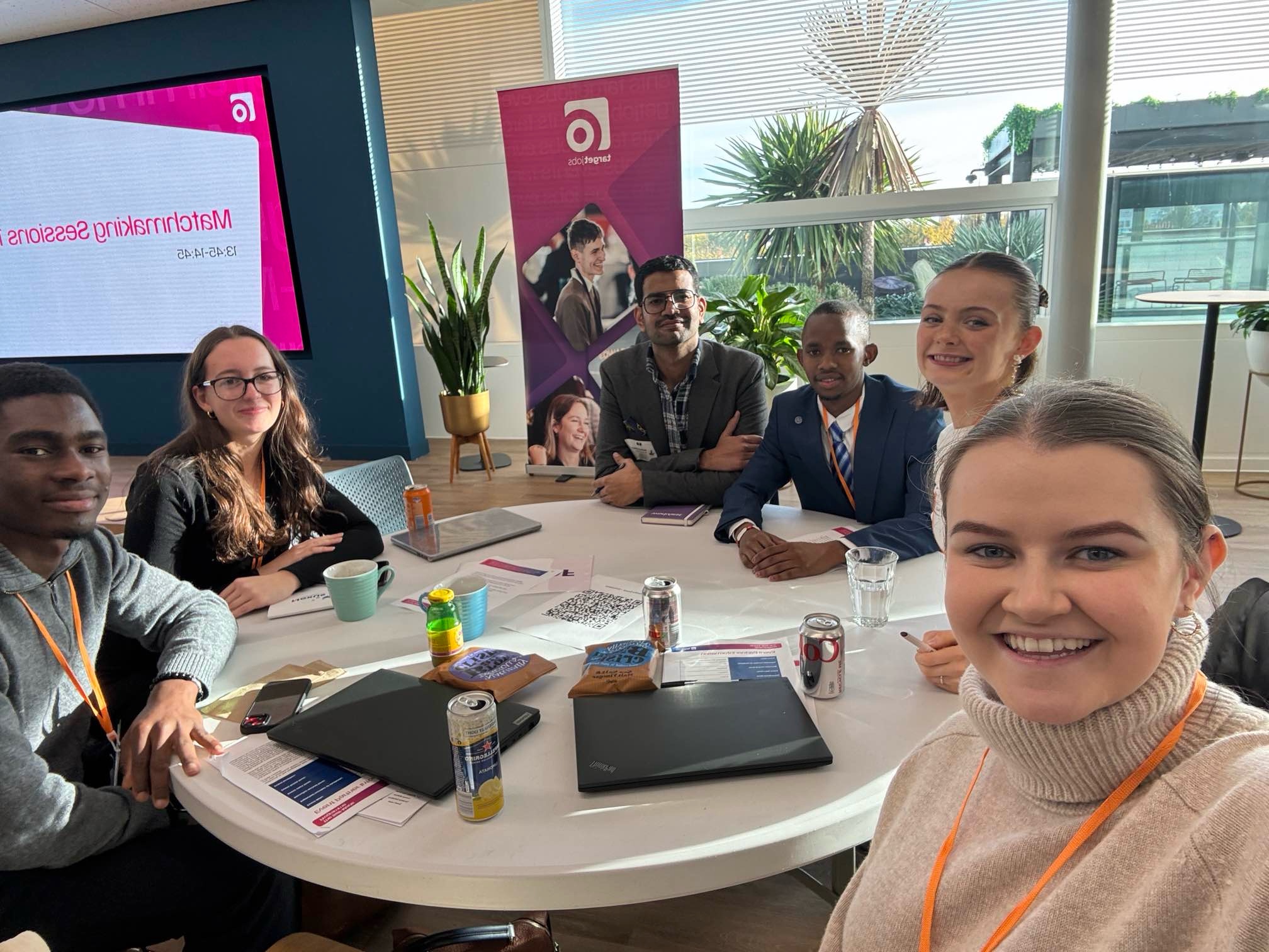
The thumbnail for this post was taken from Jessica Walker's LinkedIn profile with her consent, along with the consent of the other members featured in the photo before it was uploaded.
Week 5: Data Visualisation
I missed my data visualization workshop as I was in London attending the “Self-Made Programme” by Target Jobs, designed to help students build connections. The event opened with Cibyl’s representative presenting data visualizations illustrating the stark disparity in earnings between students from “lower income” backgrounds and those from “better off” backgrounds. After Cibyl’s short presentation, the event’s hosts reiterated the programme’s goal of levelling the playing field by “providing a platform to create new connections and open doors to exciting future opportunities.”
While returning to Leeds, I read "The Pleasure and Pain of Visualizing Data in Times of Data Power" by Helen Kennedy and Rosemary Lucy. While going over the text, I was struck by the authors' emphasis on the ideological nature of data visualization, framing it as a practice that shapes perception and constructs knowledge rather than simply reflecting reality. This perspective resonated with Cibyl’s findings at the Self-Made Programme, where the stark income disparities between students were associated with their economic background. It made me consider how these visualizations were framed and how their framing might have influenced the narrative around socio-economic inequities.
Cibyl’s conclusions likely relied on specific choices in data collection and visualization—decisions about what to emphasize, compare, or omit. A visualization of raw income differences might spotlight individual outcomes, while one focusing on systemic barriers like unequal access to internships could shift attention to structural reform. This aligns with Kennedy and Lucy’s argument: data visualizations don’t just represent facts; they craft narratives that can either highlight or obscure deeper inequities.
Reflecting on the Self-Made Programme, I wondered whether such initiatives could genuinely “level the playing field.” While offering valuable networking opportunities, they can’t fully address the systemic privileges that Cibyl’s data reveals, such as pre-existing networks or financial advantages. The ideological work of data visualization becomes evident here—its ability to inspire interventions like this event, while also underscoring the limitations of surface-level solutions to deeply rooted issues.
Ultimately, the missed workshop, the programme, and Kennedy and Lucy’s arguments clarified a key point: both data visualizations and interventions are shaped by ideology. Recognizing this allows us to critically assess their narratives and work towards solutions that address not just symptoms but systemic inequalities.
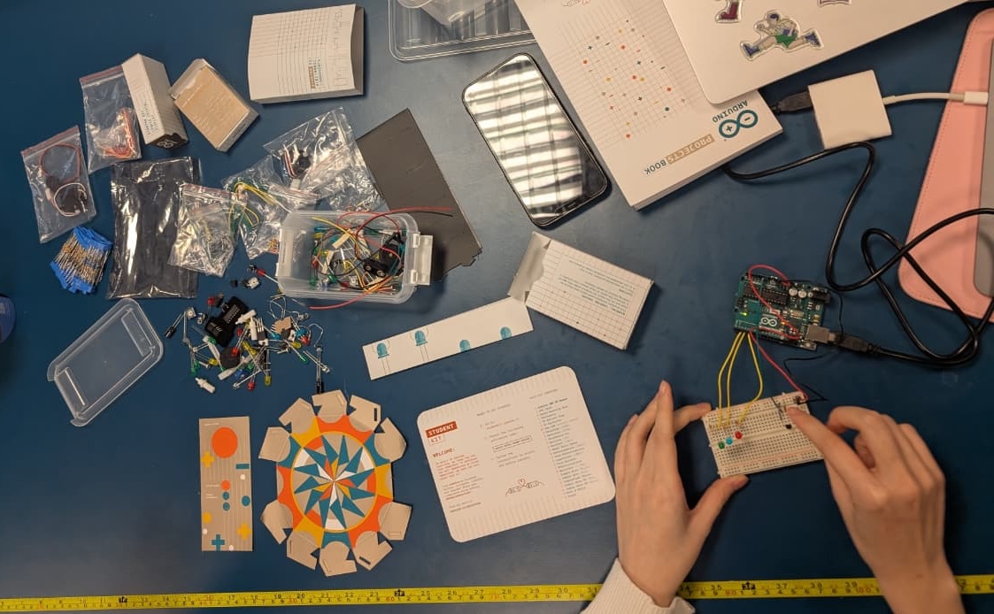
Week 7: Machine Learning
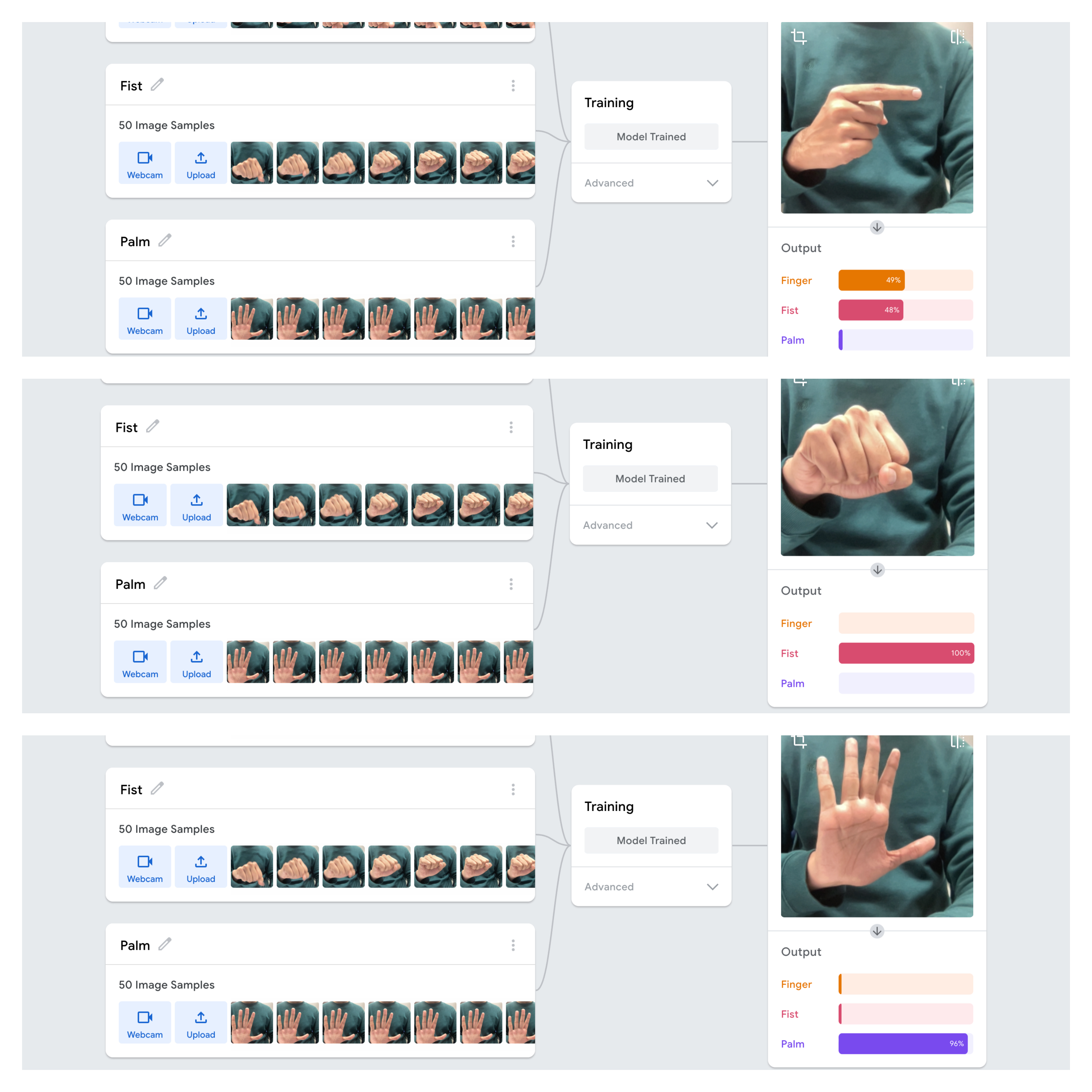
Working with Teachable Machine to train a model which recognizes three distinct hand gestures—fist, palm, and finger pose—was both an insightful and frustrating experience. Despite using 50 images for each gesture, the model correctly identified the fist and palm gestures but struggled with the finger pose. This issue, while technical on the surface, goes deeper into how predictive technologies tend to simplify and categorize human behaviours, often overlooking complexity. Drawing from auto-essentialization as discussed in Scheuerman, Pape, and Hanna’s paper on facial recognition and gender, I realized that my project mirrors the way AI systems can unintentionally ignore or misrepresent certain expressions or identities.
Just like how facial recognition systems typically reduce gender to male or female, my model reduced hand gestures to just two: fist and palm. The finger pose, despite being part of the dataset, was not recognized, highlighting how AI often simplifies complex data into basic categories. This phenomenon, where certain gestures or identities are left out, reflects the biases in AI systems that emerge from how they are trained—much like how facial recognition fails to recognize non-binary genders or other identities outside the binary.
This reductionist phenomenon reminds me of Minority Report, the film directed by Steven Spielberg, where the Pre-Crime system predicts future behaviours based on limited data, categorizing people as either potential criminals or innocent. Similarly, in my project, the model oversimplified hand gestures into just two broad categories, overlooking the possibility of a more nuanced gesture like the finger pose. This parallel highlights how both in the film and in real-world AI, reliance on binary systems can oversimplify human behaviours, erasing its complexity.
To conclude, this project revealed a critical truth: technology is never neutral. As illustrated in Minority Report, predictive systems—like my gesture recognition model—often simplify human complexity by relying on limited data and causing exclusions. Therefore, we must actively question the binary frameworks embedded in systems like facial recognition and gesture analysis, striving for models that embrace the full spectrum of human diversity.
The thumbnail of this post was generated asking DALL·E to depict the impact of algorithms on personal identity.
Week 8: Identity, Algorithmic Identity, and Data
The rise of information and communication technologies has reshaped humanity's quest for understanding existence. Our focus has shifted from pondering, "What is the essence of life?" to grappling with questions of self-presentation and the boundaries of agency. Today, it’s not just about who we are but how we curate and present ourselves. Instead of asking, "Who am I?" we now wonder, "Who does the algorithm decide I am?" This transformation highlights a deeper tension: Are we authors of our identities, or mere reflections of a system that observes, filters, and commodifies us?
Our instructor, Dr Holly, designed a three-part workshop—INPUT, OUTPUT, and PROCESS—as an exploration of how we are shaped by, and shape, the algorithms that influence our digital lives. The goal was to help us understand our roles not as passive users but as active participants in a system that constantly shapes and categorizes us.
In the INPUT phase, we reviewed our Facebook activity logs. These revealed how both intentional and unconscious interactions contribute to algorithms that categorize us into "measurable types," as Cheney-Lippold describes. Examining Facebook’s privacy settings further shattered my illusion of control; the settings protected my data from other users but not from businesses or algorithmic exploitation. This starkly reflected Zuboff’s "Surveillance Capitalism," where privacy controls seem more symbolic than protective, leaving users vulnerable to profit-driven algorithms.
During OUTPUT, we explored Google’s ad settings to see how it categorized us based on our online activity. While some classifications, like digital marketing and sustainability, aligned with my professional interests, others, such as entertainment preferences, felt disconnected from my actual habits. I couldn’t help but draw parallels with David Sumpter’s "matrix” which illustrated how algorithms simplify complex identities into predictable patterns, reducing the richness of our existence to easy-to-target data points, or what Nicholas Negroponte refers to as conversation from “atoms to bits.”
Finally, in PROCESS, we recreated Sumpter’s "matrix" by categorizing 15 posts from 32 friends into 13 predefined categories. Acting prudently, I began by defining each category which captured its essence, hoping to save time in this iterative experience. But the task of translating Instagram’s carousals, consisting of still photos and moving reels touching almost a quarter of the categories, into rigid classification, not only proved complex, but frustrating. This exercise reinforced the idea that digital systems often oversimplify our identities, forcing them into predefined moulds.
For me, the digital landscape, once a space of self-expression, now feels like a mirror reflecting an image crafted by systems beyond our control. These systems don’t just observe—they shape who we are and how we are perceived, raising profound questions about the future of identity and agency in the age of algorithms.
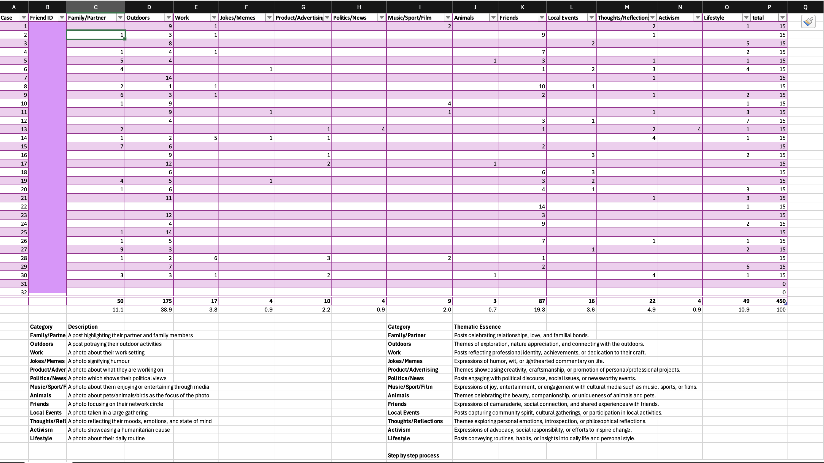
The thumbnail of this post the Excel screenshot summarizes the categorization of Instagram posts analyzed in this study.
Week 9: Digital Ethnography
Tabulating my friends' Instagram posts based on Sumpter's Matrix was nothing short of an emotional rollercoaster. To put this into context, I have not been active on social media platforms, including Instagram, for the last few years. Unaware of how this discrepancy might have influenced my Instagram feed over the years, I embarked on this journey carrying a toolkit of theoretical frameworks of Lucy Suchman, Jenny Davis, Sherry Turkle, Zizi Papacharissi, Alison Hearn, David Sumpter, Cheney-Lippold, and Melinda Sebastian. I hoped to excavate some insights into Instagram’s algorithm but did not realise how much this expedition would have stirred me emotionally.
I began using content analysis approach to define each category and capture its essence. However, my initial encounter with a “carousel” comprising still pictures and reels—revealed the limitations of this method. This challenge prompted a shift from content analysis to thematic analysis, which required “captions” to dominate the assignment process. Therefore, by reading the text in each post’s caption and establishing connections between the captions and visuals, the emerged meaning was categorised using “Elimination by Dissimilarity,” i.e., systematically ruling out irrelevant categories. However, when captions were absent or relied heavily on emojis, I derived meaning directly from the visuals, adjusting my approach accordingly.
Another limitation I observed while categorising my data stemmed from the realisation that my dataset was male dominated. Although this life choice of hanging out with male friends aligned with my cultural upbringing, this "peccadillo" clearly created a biased dataset. To counter this lopsidedness, I inserted the few female friends I had over the years to create diversity in the pool. However, this step was insufficient to balance the skewness among the demographics.
Lastly, before unveiling the study's findings, I want to confess that I could not complete Sumpter’s “matrix” and had to stop at the 30th profile instead of populating all 32 profiles, as per the original experiment. Due to my inactivity on Instagram, I have missed my friends’ achievements and development over the years. Thus, going over their profile brought a rollercoaster of emotions, starting with excitement and wonderment that slowly transitioned into melancholy and finally ending with nostalgia. This experience was akin to how Matthew McConaughey, in Interstellar, felt during his scene, named aptly, the “years of messages.”
The findings of the experiment – where "Outdoors" category dominate at 38.9%, followed by "Friends" (19.3%), "Family/Partner" (11.1%), and "Lifestyle" (10.9%) of the posts– highlight Instagram's role as a mediating platform where identity, sociality, and algorithmic logics intersect. Using Zizi Papacharissi’s “networked self” framework, the popularity of "Outdoors" posts reflects Instagram’s ecosystem allowing users to curate their digital personas to align with the platform’s affordances of visually striking content. Building on Jenny L. Davis’s lens of perceived and actualised affordances, John Cheney-Lippold’s concept of algorithmic identity would view this behaviour as not merely user-driven but shaped by the platform’s algorithmic design, which amplifies content categories proven to drive engagement. This recursive relationship between user action and algorithmic nudging creates a feedback loop that privileges certain aesthetics while marginalising others, subtly shaping human behaviour in digital spaces.
The “animals” classification was the least represented with only three posts. Interestingly, female users, made up just 13% of the sample size, contributed 67% to the pet-related content, aligning with Instagram’s critique of gendered affordances by Melinda Sebastian. In her work "Instagram and Gendered Surveillance," she argues that Instagram’s design subtly enforces discipline by rewarding content that aligns with dominant cultural and gendered ideals, perpetuating gender norms.
Additionally, my analysis uncovered an underrepresentation of categories like "Politics/News" and "Activism," which I attribute to the performative and depoliticized nature of Instagram’s ecosystem. Sherry Turkle’s critique of digital personas—where users present fragmented, idealized versions of themselves—helps explain this underrepresentation. Instagram’s visual-first interface tends to favour content that supports an aspirational, often depoliticized, identity rather than content that challenges the status quo or engages in political discourse. This finding resonates with Turkle’s observation that social media platforms like Instagram promote a sense of connection and belonging through shared, curated experiences, rather than fostering critical engagement with complex societal issues.
This underrepresentation of politics and activism also aligns with Alison Hearn’s view of the commodification of identity, where platforms like Instagram prioritise content that supports the economic and social interests of brands and advertisers over socially or politically charged narratives. This commodification of identity, while enabling visibility and connection, also narrows the scope of authentic self-representation as users optimise their personas for public consumption. These practices, as Lucy Suchman would argue, are situated actions that reward aesthetically polished and socially sharable content.
Finally, David Sumpter’s Matrix, which was the foundation of my study, serves as a critical tool for understanding the algorithmic structure of Instagram. Sumpter’s work on the categorization of content based on networked behaviours helped me navigate the data, although my analysis was somewhat hindered by personal biases and the emotional weight of revisiting old connections. This emotional journey, which fluctuated between excitement, melancholy, and nostalgia, also mirrors the emotional impact Instagram has on users as they interact with curated content that reflects both personal and collective identities. As Mary L. Gray and Siddarth Suri have pointed out, the unpaid labour users contribute to sustaining Instagram’s ecosystem—through the constant production of content that fuels the platform’s engagement-driven metrics—further complicates our understanding of social media interactions as both emotionally and economically charged.
In conclusion, this project exposes how Instagram’s algorithmic design and its affordances shape not only the visibility of certain types of content but also the emotional experiences of its users. The intersection of these forces—platform affordances, user behaviour, and algorithmic feedback loops—reveals how Instagram promotes a commodified and performative self, shaped by both social norms and algorithmic nudges. Through the lenses of Suchman, Davis, Hearn, Cheney-Lippold, Turkle, and Gray and Suri, we can see that Instagram is not simply a space for social interaction but a complex ecosystem where identity, emotion, and digital labour converge. The platform’s impact is both profound and subtle, shaping the way we present ourselves, engage with others, and experience digital spaces in increasingly commodified and algorithmically mediated ways.